Customer Experience Redesign for Yahoo
2016 - Product Designer
The objective
To reduce in-house customer success cost by enabling users to manually resolving most common issues among Yahoo users (account, password, mail).
The outcome
Improve the information hierarchy of the Yahoo help site based on user research. Design and launch a community forum site emphasizing the most needed products.
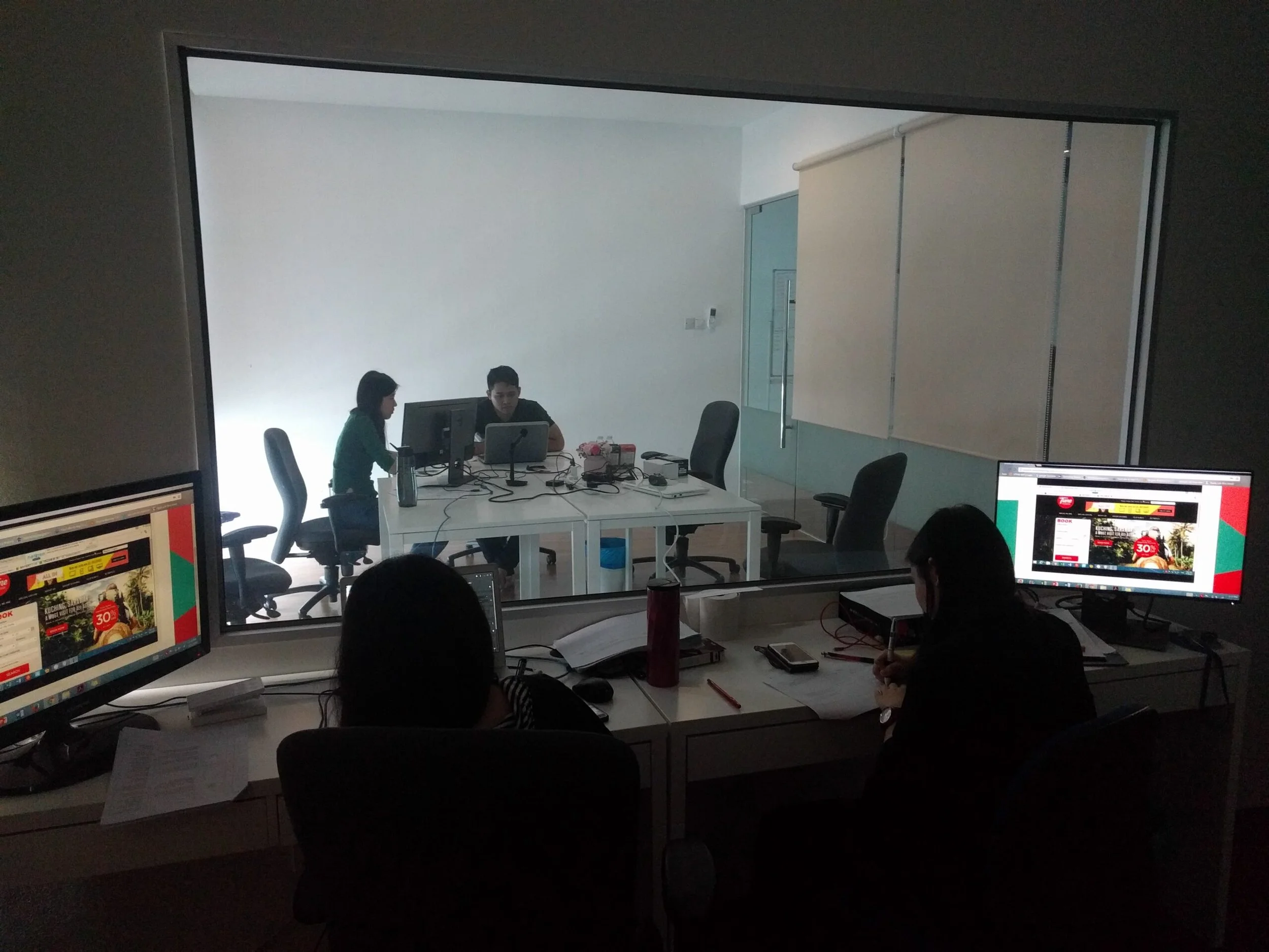
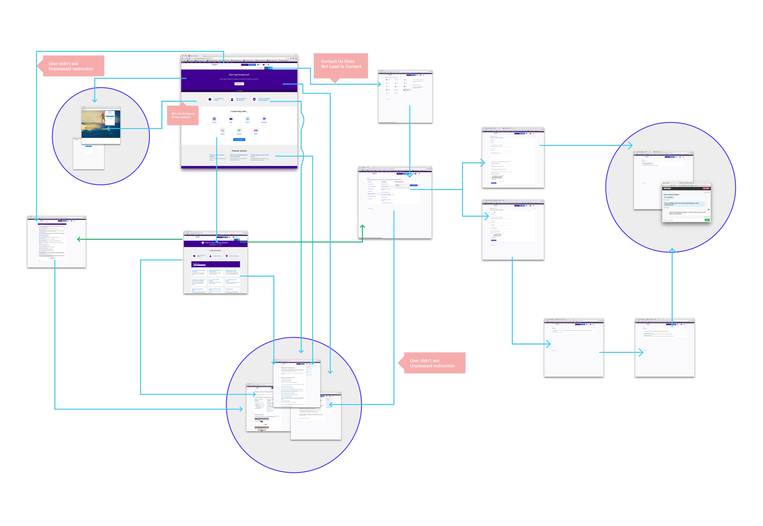
Existing Help Site and Forum
-

Links & Call to Actions
The existing help site showcased a number of links and call to actions without descriptions. Often causing confusion and frustration.
-

Confusing Workflows
The existing site showcased long workflows that often led more users to calling the help centers.
Research
Card sorting & prototype testing
To better understand how a user thinks and to validate concepts, a series of user testing were conducted to help improve Yahoo’s customer experience websites. Testing methods include cart sorting of all help related categories and workflow testing with prototypes.
Analysis of existing website workflows and information architecture
Key Takeaways
-
User Mental Models
Utilizing a card sorting method, users consistently grouped help related topics in to two large buckets. One group being help with personal products vs help with business related products. This finding was different then the internal grouping of Yahoo products by sports, news, and more.
-
Navigation Hierarchy By Product Importance
Users scanned for the immediate product they were experiencing the issue with. The majority of issues were related to Yahoo mail, account, and sports.
-
Content First
Users struggled with previous implementations that required users to dig for help articles or helpful community tips. Instead the redesign highlighted key topics, articles, and discussions on the landing page.
Solution
The redesigned help site and forum displayed topics by products experiencing the most issues, personal products, and business-related products. Directly implementing the data found in qualitative and quantitative research. The redesigns also simplified the overall navigation by highlighting content and discussions directly on the primary landing pages. Avoiding requiring the user to dig multiple pages deep to find their solutions.

User Mental Models
Navigation showcased products with the most experienced issues. A dropdown menu classified all products into two larger buckets. Personal and business related products.
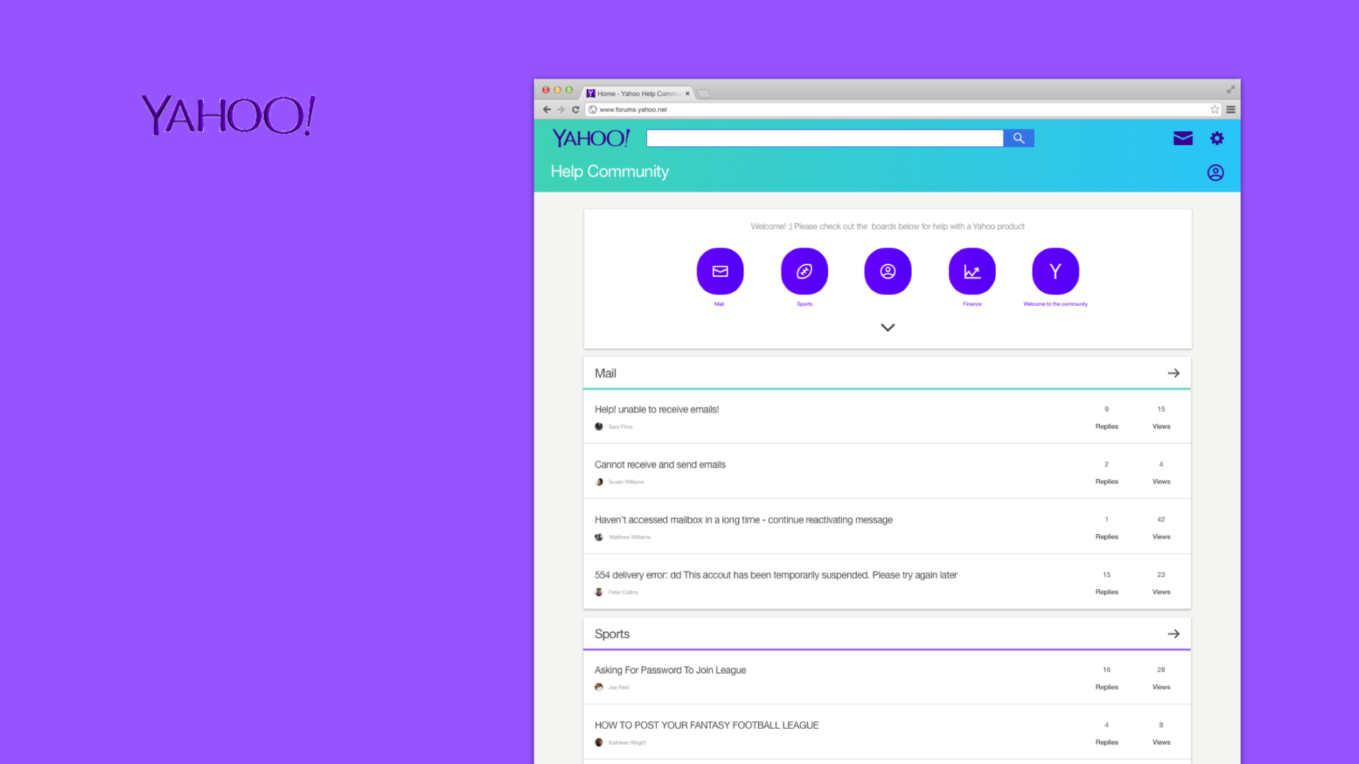
Improved Navigational Hierarchy
On the Yahoo help forums, products with the most experiences issues was emphasized.

Content First
Pages were redesigned to highlight content and functionality related to resolving issues.