Givelify
2018 - Fintech Consumer Giving Platform
Business Goals
Increase user’s ability to discover organizations and create habits around giving. Create a cohesive visual interface language to marry cross-platform products.
Problem Space
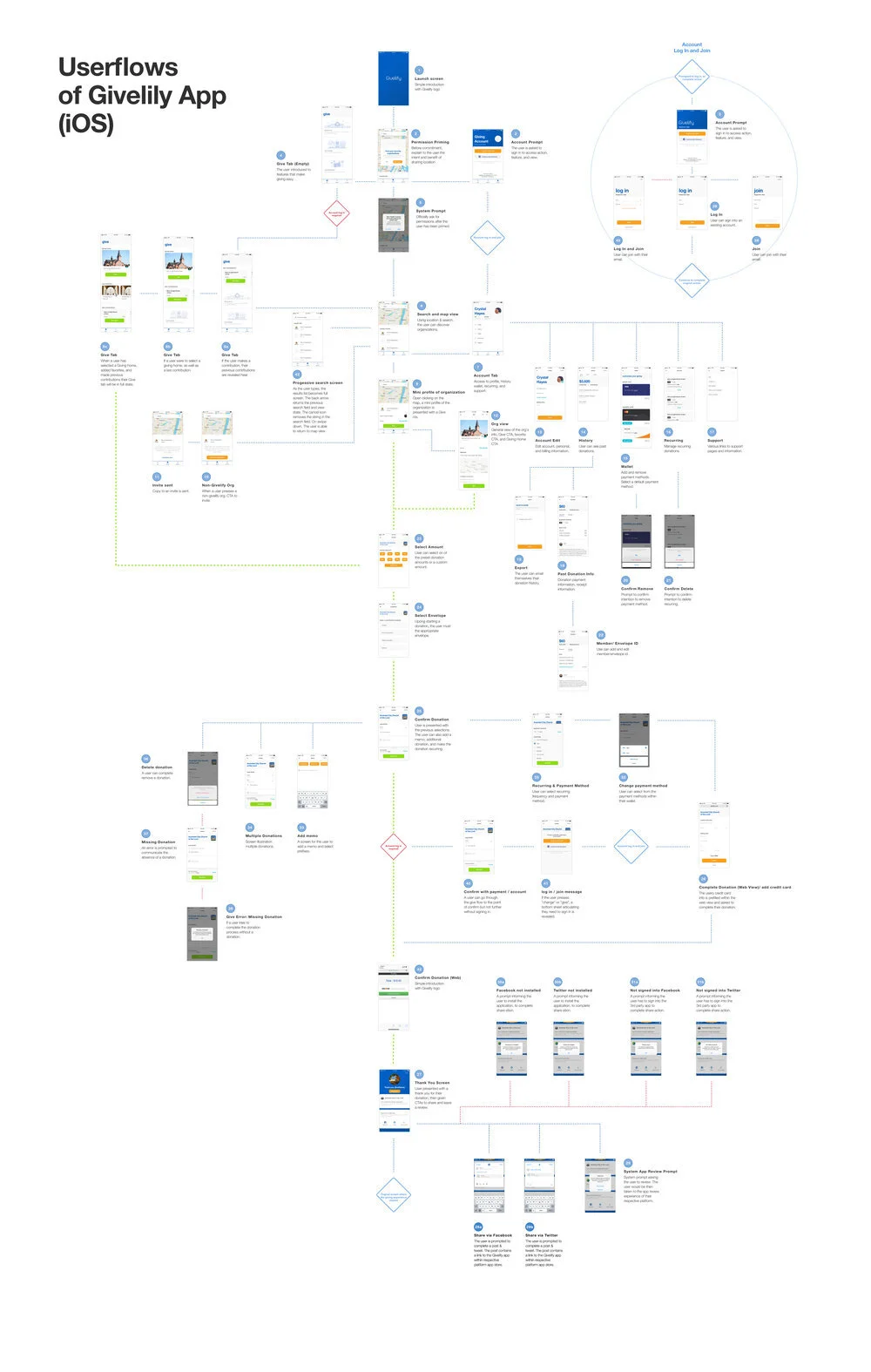
Consumer-facing Mobile App
The average Givelify user gave donations to only one organization, but often struggled to discover new organizations they would be interested in giving.
B2B Web Dashboard
Features for manage received donations, financial reconciliation and fund raising campaigns were often underutilized. Identify feature alignment with user’s needs and fix usability issues.
Role
Principal designer & design lead. Oversight of junior designer and research.
Research Methods
User interviews, card sorting, usability testing, prototype testing, and contextual inquiries.
Solution
Reduce barriers to discovery and recurring giving on consumer facing platforms.
Re-educate internal team on the B2B user and strategize a product direction develop more appropriate feature sets.
Create a cohesive design system to create consistency of interaction and visual design across platforms.
Design System Elate
Mobile App
Visual Exploration & Final Design
Explorations

Final Visual Direction

Management Dashboard
Information Architecture
Solution Strategy
A better UX based on our research was to develop an operational dashboard versus a strategic dashboard. A strategic dashboard would make sense for management or strategic role users. After conducting numerous in-person interviews, the average user of the Management Dashboard was purely task oriented and often ignored all analytics.

Incorrect Design Direction.
Strategic oriented dashboard design for organizations frequently needing analytics to make top-level decisions.

Operational Dashboard.
Operational dashboard design for the average to better perform their tasks and sharing functionality to better distribute analytics to management.